The second card is much simpler, with background stamping using versamark and white brilliance ink. The main image is a cute kitty from penny black. The round sentiment on the card front as well as the one on the inside are both from Hero Arts. I added glitter on the ornament though the camera did not pick up the glitter. It makes the ornament look very pretty IRL. =)
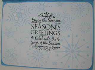
The reason why I chose to attach almost a whole sheet of insert with the stamped background and greeting is due to the thin cardstock I was using for the card base. It was cardstock from a 12 by 12 pad of scrapbooking paper. I have tried and did not like the cardstock from that brand. Neither did I like the other brand I have tried so far - American Crafts. They are both too thin for my preference for card bases.
Which of the two do you like better?


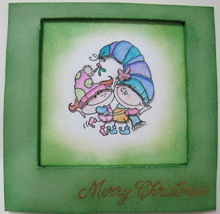
I like the 2nd card the best, BUT, I totally love the image on the 1st card!
ReplyDeleteJamey
I like the second card better in terms of colour scheme and layout too! The recessed was a new technique for me and I would probably make the recessed window off centre so that it is not so 'square'.
ReplyDelete